::: MISSIONARY STAMPS - Large Numeral Comparisons :::
|
|
 Back to Printer’s Type Comparison.
|
Much attention focused at the trial of Klemann v. Grinnell on differences between
the large numeral "2's" in the Grinnells compared to the genuine. Witnesses
testified how the tail of the genuine angles sharply up where the Grinnell tail is
tapered. Using blow-up comparisons, we can see the shapes of the large numerals in
all three values are different in the Grinnells than in the genuine:
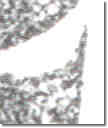
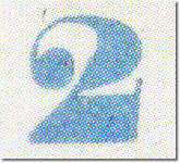
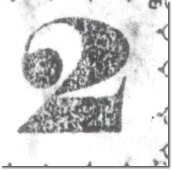
 The Large Numeral 2: The Large Numeral 2:
|
2 Type I
Advertiser Lot 12
|
Grinnell #51
|
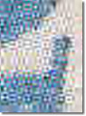
2 Type II
Advertiser Lot 11
|
Grinnell #9
|

|

|
|
|
|
 Note the tapered tail on the Grinnell compared to the
sharp angle of the genuine; the tail points outward to behind the back of the 2 on
the genuine, but hits the back of the 2 on the Grinnell. Note the tapered tail on the Grinnell compared to the
sharp angle of the genuine; the tail points outward to behind the back of the 2 on
the genuine, but hits the back of the 2 on the Grinnell.
|
The inner space of the upper loop is smaller in the
Grinnell.
From all appearances, the base of the genuine is
thicker than the Grinnell, but careful measurement of the Grinnell is needed to
confirm this difference.
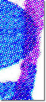
The Large Numeral 5:
|
5 Type I
Trepel Census 2-I-UNC-16
|
Type I
Grinnell #22
|
5 Type II
Advertiser Lot 15
|
Type II
Grinnell #25
|

|

|
|

|
|
In the genuine, the point of the upper part nearly
touches the lower ball.
The top flags of the 5's are quite different.
It seems the fat portion of the lower 5 is fatter in the
genuine.
A narrower inner space in the lower 5 is quite apparent
in the genuine.
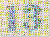
The Large Numeral 13:
|
13 Type I
Advertiser Lot 21
|
Grinnell 53
|
13 Type II
Advertiser Lot 20
|
Grinnell 52
|
|

|

|

|
|
Neither the serif nor the base of the large 1 is the same.
Inner spaces of the Grinnell "3's" are shaped differently.
The inner stem of the Grinnell "3" points upward.
The foregoing notes mention only highlights of the differences. No argument can be
made that the same type pieces made the Grinnells and the genuine large Numerals.
Proponents of the Grinnells will argue these differences could simply be the result
of wear. Given the major changes of shape, the argument cannot convince.
Alternatively, the Grinnells are said to have been a different printing. A
separate study puts to rest any notion of a multiple printing theory. The point
here is simply to show the large numerals used in the genuine stamps were not used
in the Grinnells.
|
|
Back to Printer’s Type Comparison.
|
|

|
|
Copyright © 1999 - 2004 POST OFFICE IN PARADISE. All rights reserved.
|