::: BANK NOTE ISSUE - Comparison of Scott 31 and Scott 31a :::
|
|
 Back to 1864 2˘ Kamehameha IV, Scott No. 31.
|
|
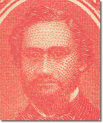
Scott No. 31, the
red-orange NBNCo. stamp, from the Seventh Printing
|

|

|
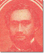
Scott No. 31a, the vermilion ABNCo. stamp
with no hint of orange
|
|
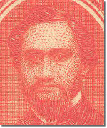
Distinguishing between Scott 31, the red-orange NBNCo. stamp of the 1860's and 1870's,
and Scott 31a, the vermilion ABNCo. stamp of the 1880's, is difficult. When the ABNCo.
printed Scott 31a, it used the old NBNCo. plate. Thus, no minute design changes help us
distinguish the new vermilion stamps from the older red-orange stamps.
The ABCo. Monogram
ABNCo. engraved its monogram ABCo. [no "N"] on the NBNCo. plate in the left selvage
along side position 16 and in the right selvage along side position 35.
Click Here to see the
layout of the monogram. If one has a position 16
stamp with the left selvage intact or a position 35 stamp with the right selvage
intact, the presence or absence of the ABCo. monogram will prove a Scott 31 (monogram
absent) or Scott 31a (monogram present). Why the ABNCo. added this monogram twice to
the plate used for Scott 31a and once to the plate used for the 18˘ stamp (Scott No. 34)
but not on the other NBNCo. plates used by the ABNCo. remains a mystery. See Bank Note
Plate Layouts.
|

|
|
The ABCo. monogram
alongside Position 16
|
|
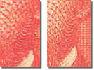
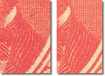
Color Difference
The orange element in the color of Scott 31 is completely lacking in Scott No. 31a.
This color difference is the most reliable test for many collectors. Attempting to
distinguish these colors under artificial lighting is almost impossible. A white
light will be the best if using artificial light is necessary. Sunlight is better
than any other light source for seeing the presence of orange.
|

|

|
|
Scott 31
|
Scott 31a
|
|
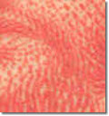
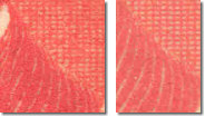
Gum Difference
If you have a stamp with original gum, distinguishing Scott 31a from 31 is easier.
Brownish gum, unevenly applied by hand, was used on all of the NBNCo. printings (Scott
No. 31). The ABNCo. used a yellowish gum, evenly applied by machine, on Scott No, 31a.
|

|

|
|
Scott 31
|
Scott 31a
|
|
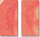
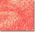
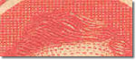
Paper
Paper differences are not much help. Some papers of the earlier printings of Scott
31 are coarser than the finer weave used by the ABNCo., but it is too difficult to
separate Scott 31a paper from the later printings of Scott 31.
|
|

|
|
Scott 31
|
Scott 31a
|
|
Plate Re-Entry Evidence
For an untrained eye, these colors appear almost identical, leading collectors to
search for positive identification in other clues. However, no other conclusive test
has been found. There is a subtle change in the King's appearance on many Scott 31a
stamps. But since this change affects only some plate positions, at the end of the
day it only serves as positive identification for a Scott 31a stamp from one of the
affected plate positions but fails to eliminate Scott 31 as a possibility for other
positions.
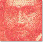
Dr. Herbert Munk, a great philatelic scholar of the early Twentieth Century,
commented: "The chief difference seems to be in the expression on Kamehameha IV's
face; he looks younger and more alert on the vermilion stamp. His hair and beard also
seem to stand out more clearly from the background in the newer stamp . . ."
Meyer and Harris submitted photographs of the two stamps to a Philadelphia "analytical
photographer" named Raymond D. Kershner who described the King's face as looking "old
and haggard" in Scott No. 31 but "rejuvenated" in Scott No. 31a. As they saw it:
"Kamehameha looks old and haggard, needs a beard trim, looks frowsy in general [in
Scott 31]." However, in Scott 31a, he "is neater, eyes clearer, beard trimmed, looks
better in every way." This "make-over" only applies to some positions on the Scott 31a
sheet. Meaning some Scott 31a stamps have the same, old, tired looking king's image.
Frankly, I don't find the "old king" so haggard as Meyer and Harris describe him, but
there is a subtle freshness to the king's face in stamps from many plate positions in
Scott 31a compared to Scott 31. However, another comment by Kershner is more
noticeable: "Kamehameha is looking past us, slightly to our left" in Scott 31 but
"is looking us in the eyes, though he has not turned his head" in Scott 31a.
At Meyer Harris, p. 216-218, an analysis of these differences and their cause is
offered. There, the authors state Clarence W. Brazer (the renowned authority on
proofs and printing of the mid-20th Century) examined the stamps and concluded the
ABNCo. "wash etched" the die. The Williams Brothers explained "etching" in
Fundamentals of Philately, p. 126, as follows: "coating the surface of the die
with an acid resist, then scratching part of the resist away, and allowing acid to eat
away that part of the metal that has been thus exposed." Wash-etching, the phrase
used by Brazer, is not explained by the Williams Brothers, but is used by Brazer to
describe a process of retouching the die by exposing certain larger areas of the die
(as opposed to exposing only specific lines) to the acid etching method described by
the Williams Brothers.
Brazer explained the NBNCo. did not harden its plates so plate wear could be repaired
(and thus making it possible for the ABNCo. to engrave its monogram on the plate). A
softer plate also permitted re-entry of the die at specific plate positions.
According to Brazer, the ABNCo. re-entered some - but not all - plate positions using
the die retouched by wash etching. This explanation is probably correct but since
records were not kept, exactly why the King's appearance changed is uncertain.
POSITIONS 17 AND 18 COMPARED
Brazer pointed to positions 17 and 18 of the ABNCo. printing, as evidence that only
some positions were re-entered. According to Brazer, position 17 was not re-entered
but position 18 was re-entered. Following Brazer's conclusions, differences should
exist only between Nos. 31 and 31a in position 18 and position 17 should be identical
except for color. However, even in position 17 of Scott 31a the King's appearance
seems fresher than in Scott 31.
|
Positions 17 and 18 of the NBNCo. plate (Scott 31) for comparison; taken from the
last NBNCo. printing.
|
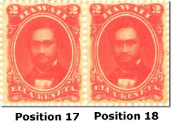
|
|
Positions 17 and 18 of the ABNCo. printing.
There is a subtle freshness in the king's appearance in position 18 compared to
position 17. Examination of details proves even position 17 was re-entered but there
is less effect of the wash etching done on the die. This difference suggests the die
was wash etched and some positions were re-entered and the die was further etched
before entering other positions.
|

|
|
According to conclusions by Kershner and Brazer, evidence of the retouched die is seen
in many details. Brazer focused on nine areas to demonstrate the differences.
Kershner commented on most of the same nine areas Brazer described. I have added the
wave at the top of the head as another area for study. For consistency, the following
images have been taken from positions 17 and 18 of the last NBNCo. printing and
positions 17 and 18 of the first ABNCo. printing.
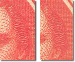
King's Head
|
|
Position 17
|
Scott 31
|
Scott 31a

|
|
Position 18
|
Scott 31
|
Scott 31a
|
|
|

|
King's Face
|
|
Position 17
|
Scott 31

|
Scott 31a

|
|
Position 18
|
Scott 31
|
Scott 31a

|
|
|
Detail
|
Kershner Comment
|
Position 17:
No. 31-No. 31a
|
Position 18:
No. 31-No. 31a
|
Brazer's Comment
|
|
|
|
|
|
|
Beard
"More detail in beard, particularly between the chin and
ear" in Scott 31 and "little detail in beard, space between chin and ear practically
solid" in Scott 31a.
|
31


31a |
31

31a |
"The beard was strengthened by wash
etching and its outlines trued up at the same time. (This is where the beard trim
comes in.)
|
|
|
Beard Below Ear - Detail
See comment under Beard.
Again Kershner and Brazer are vague as to which
side. The effect shows better on the king's left (right side of stamp).
|
King's left

King's right

|
King's left
King's right

|
See Kershner comment under Beard.
Brazer made no specific remark about the space between the chin and ear.
|
|
|
Moustache Tip on Right
Kershner made no specific comment on this area.
|
31

31a
|
31

31a
|
"Note edge of one wash area showing
below end of moustache at right side of stamp - a straight horizontal line."
The tip of the moustache seems to blend into the beard in
Scott 31a, but has a more distinct edge in Scott 31.
|
|
|
|
|
|
|
|
|
Left shoulder (right side of stamp)
No specific comment.
|
Detail

|

Detail
|
"A small wash-etched area on his left
shoulder in the 1864 stamp has been enlarged to a large one, whose straight vertical
edge shows conspicuously." I cannot see what he
means, except in both positions, the lines of the coat seem sharper.
|
|
|
|
|
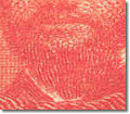
Wave at Top of Head
No specific comment.
|
31


31a
|
31

31a
|
No specific comment.
I see noticeably more white spaces in Scott 31 than in
Scott 31a. Also, this effect seems present in both positions.
|
|
|
Back to 1864 2˘ Kamehameha IV, Scott No. 31.
|
|

|
|
Copyright © 1999 - 2005 POST OFFICE IN PARADISE. All rights reserved.
|