::: MISSIONARY STAMPS - Style 236.11 Comparisons :::
|
|
 Back to Grinnell Missionaries.
|
Comparisons Of Genuine Strikes With Grinnell Strikes
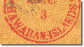
Style 236.11: HAWAIIAN-ISLANDS at bottom
|
As with the style 236.05 postmark (see Comparison of
U.S. Postage Paid at bottom), the postmark
of this style on the Grinnells is unique to the Grinnells and is found on no other
Hawaiian stamp or cover. Unlike style 236.05, we have accounted for all four of
the style 236.11 devices Whitney ordered in May, 1851. (See
Honolulu Foreign Mail Postmarks to 1886 and
Honolulu Local and Interisland Mail Postmarks to 1886.)
- while we are on that link, please change the title of that page to Honolulu Local
and Interisland Mail Postmarks to 1886.] Thus, the device used for the Grinnells
could not have been one used at the Honolulu Post Office in the early 1850's. The
Grinnell strikes also show the same evenness suggesting they were machine tooled
rather than hand-cut. To persuade collectors the Grinnell strikes are genuine
would require one to explain how a fifth device of a machine tooled metal
construction, existed alongside the hand-cut boxwood devices Whitney ordered.
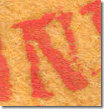
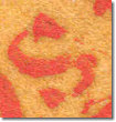
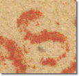
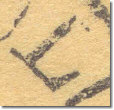
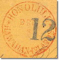
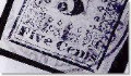
Grinnell Strikes of style 236.11
|
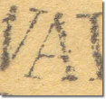
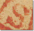
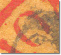
Grinnell Nos. 1 and 2
Dated MAR/1
|
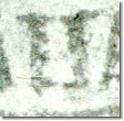
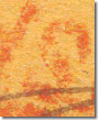
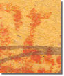
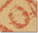
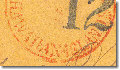
Grinnell No. 64
Dated JAN/11
|
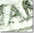
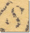
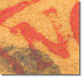
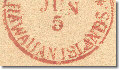
Grinnell No. 27
Dated FEB/5
|

|

|

|
|
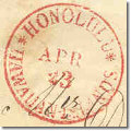
The Four Genuine Types of Style 236.11
|
236.11 (I)
|
236.11 (II)
|
236.11 (III)
|
236.11 (IV)
|

March 11, 1852
|
April 23, 1855
|
December 8, 1856
|
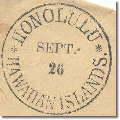
September 26, 1864
|

December 3, 1852
|

June 5, 1855
|

April 8, 1857
|

December 25, 1854
|
|
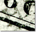
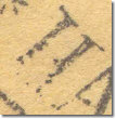
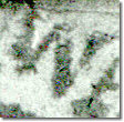
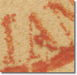
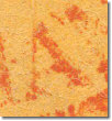
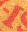
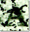
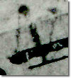
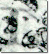
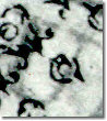
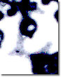
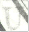
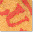
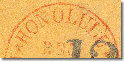
None of the Grinnell black and white images yields a good strike of style 236.11.
Much detail is lost in the background of the stamp. Nonetheless, enough
significant features are sufficiently clear to obtain comparisons. Specific
differences are:
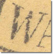
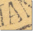
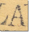
- Font of HAWAIIAN ISLANDS
A smaller font size was used for the Grinnell device as is shown in the
following details:
|
Grinnell No. 64
|
236.11 (I)
|
236.11 (II)
|
236.11 (III)
|
236.11 (IV)
|
|
|
|
|

|
|
Also, the words are set farther from the outer rim in the Grinnell and each of the
letters is shaped differently. No hyphen is visible in the photographs of the
Grinnell. Type II of the genuine marks has a weak hyphen and the others have
strong hyphens.
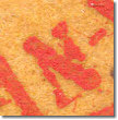
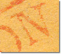
"HAWAIIAN" Detail:
|
Grinnell Nos. 1-2 ("H") and 47 (all others)
|
236.11 (I)
|
236.11 (II)
|
236.11 (III)
|
236.11 (IV)
|
|
|
"H": none of the genuine have the squarish look of the Grinnell.
|
|
|
|
|
First "A": the cross-bar is lower in the Grinnell than in any genuine.
|
|
|
|
|
"W": the raised W and short left side of the Grinnell is unlike any genuine.
|
|
|
|
|
Second "A": no genuine "A" has the huge bottom serif of the Grinnell.
|
|
|
|
|
"II": the Grinnell letters are too square and stubby.
|
|
|
|
|
Third "A": type III is spread at approximately the same angle but the cross-bar of the Grinnell is too high.
|
|
|
|
|
"N": the Grinnell is too stubby and lacks a serif at the top of the left leg.
|
|
|
|
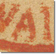
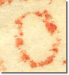
"ISLANDS" Detail:
|
Grinnell Nos. 13 and 63 (second "S")
|
236.11 (I)
|
236.11 (II)
|
236.11 (III)
|
236.11 (IV)
|
|
|
"I": Difficult to get a good image of the Grinnell; note the absence of a hyphen and the stubbier letter in the Grinnell.
|
|
|
|
|
First "S": no genuine strike has the same shape.
|
|
|
|
|
"L": the thick foot and stubby shape is unique to the Grinnell.
|
|
|
|
|
"A": no genuine is close to the wide angled Grinnell "A."
|
|
|
|
|
"N": this Grinnell "N" looks similar to the Grinnell "N" in "HAWAIIAN" and lacks a serif at the top of the left leg.
|
|
|
|
|
"D": the interior shape is unlike any genuine.
|
|
|
|
|
Second "S": the Grinnell is strikingly different in shape.
|
|
|
|
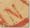
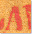
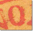
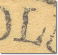
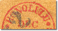
- Font of HONOLULU
Again, the font size is smaller and set farther from the outer rim than in
the genuine marks. Each of the letters has a different shape.
|
Grinnell No. 64
|
236.11 (I)
|
236.11 (II)
|
236.11 (III)
|
236.11 (IV)
|

|
|

|
|

|
|
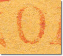
"HONOLULU" Details:
|
Grinnell Nos. 1-2, 49 (last "U") and 63 (last "L")
|
236.11 (I)
|
236.11 (II)
|
236.11 (III)
|
236.11 (IV)
|
|
|
"H": the short, squareish Grinnell with the high cross-bar is unlike any genuine.
|
|
|
|
|
First "O": the interior shape of the Grinnell is too wide.
|
|
|
|
|
"N": in the Grinnell, there is no serif at the top of the left leg.
|
|
|
|
|
Second "O": this letter is shaped reasonably close to types II and IV of the genuine but is too short.
|
|
|
|
|
First "L": type II of the genuine is the closest to the Grinnell but the base is shaped differently.
|
|
|
|
|
First "U": type II of the genuine is close but the interior space of the Grinnell is too wide.
|
|
|
|
|
Second "L": the thick base of the Grinnell is unlike any genuine.
|
|
|
|
|
Second "U": type IV of the genuine is closest to the Grinnell but the top serifs are different.
|
|
|
|
|
Back to Grinnell Missionaries.
|
|

|
|
Copyright © 1999 - 2004 POST OFFICE IN PARADISE. All rights reserved.
|